Take the first step toward protecting what matters most
Reach out today to start your estate or elder care plan with personal, compassionate guidance.
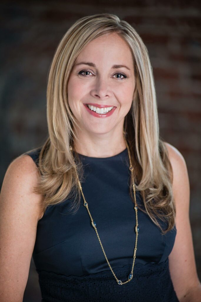
Heather L. Turner, Esq.
Trusted Estate Planning & Elder Law Attorney
Since 2011, Heather Turner has helped families across Southeastern Pennsylvania navigate estate planning, probate administration, and long-term care planning with clarity and confidence.
Heather is known for making complex legal matters understandable and approachable. Her practice focuses on practical, personalized planning — from wills and trusts to Medicaid qualification and supplemental needs trusts — helping families protect what they’ve built and prepare for the future.
She continues to serve clients from Wilcox and Valentine, PC and Levandowski & Darpino, LLC, providing consistent support across the Southeastern Pennsylvania.


Thoughtful Planning for Modern Families
Every family deserves security and clarity. Whether you’re raising children on your own, building your family by choice, or parenting as a same-sex couple, Heather can help you create a plan that protects what matters most.
Plan with confidence.
Every family’s situation is unique. Heather takes the time to listen carefully, understand your goals, and design a plan that reflects your values while protecting the people who matter most to you.
Whether you are preparing a will, establishing a trust, navigating probate, planning for long-term care, or seeking guidance on Medicaid eligibility, you’ll receive clear explanations and thoughtful legal strategies tailored to your specific needs. Heather believes that informed clients make confident decisions — and she is committed to making complex legal topics understandable and approachable.

Estate Planning
Wills, trusts, powers of attorney – customized plans to protect your family and assets.
Medicaid & Long-Term Care Planning
Helping families plan for long-term care, Medicaid qualification, and asset protection.
Probate & Estate Administration
Guidance through simple and complex estate matters with clarity and steady support.
Supplemental Needs Trust
Protecting individuals with disabilities while preserving eligibility for benefits and more.
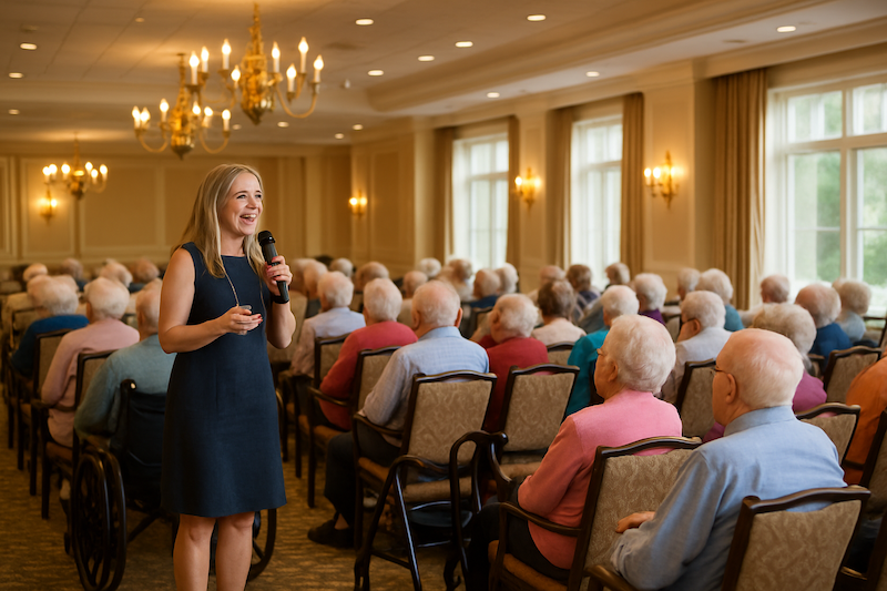
Invite Heather to Speak at Your Next Event
Heather regularly offers educational seminars on estate planning, estate administration, Medicaid qualification, and long-term care planning as part of her commitment to serving the community.
She presents at senior centers, assisted living communities, libraries, faith groups, professional organizations, and parent groups — helping families better understand their options and plan with confidence.
If you are organizing a community program or professional event, Heather is happy to speak and provide clear, practical guidance tailored to your audience.